Website Checkout Re-design
Our strategic goals and outcomes

Discover.
We had strategic business goals to move the checkout to a new backend framework. This meant there was a great opportunity to re-look at the whole checkout customer experience. I took the business goals and worked with our squad to write a hypothesis for what we wanted to achieve with this redesign.

Our Hypothesis
We believe that people want to checkout and pay for their groceries quickly and easily.
So if we focus the screen around guiding customers to checkout in a clear and simple way.
Then we will see a decrease in the average time it takes to checkout and an improvement in the Customer CSAT score for ease of checkout.
While in discovery
As a team we created a lean canvas to focus what we needed to look at
Analysed how customers where using the current checkout and where they were going
I Looked at customer verbatim to see if we could identify any pain points room for improvement and created an empathy map.


Discovery work also included exploring what our competitors offered and how we sat alongside

I looked at best practise UX recommendations for checkouts and how our current checkout compared and what new patterns we could recommend or explore using in the new design work.

Journey Mapping
I mapped out the all the different journeys a customer might take to checkout to help us spot potential opportunities for improving the existing journeys. There was many different entry points for a customer to enter checkout and also 2 key journeys for checkout itself. The first initial checkout journey and then an amend checkout journey.

Define.
“How might we create a checkout that is simple and easy to navigate, that customers trust and feel is secure?”
Key recommendations
I started to pull out my recommendations based on all I had learnt from the discovery phase. These are the key improvements below
-
keeping the customer focused at the task of hand which is checking out. But also leaving the top used navigation features at this point like search and the basket to allow customers to complete journeys like forgetting to add one item or needed to add or remove items from their basket.
-
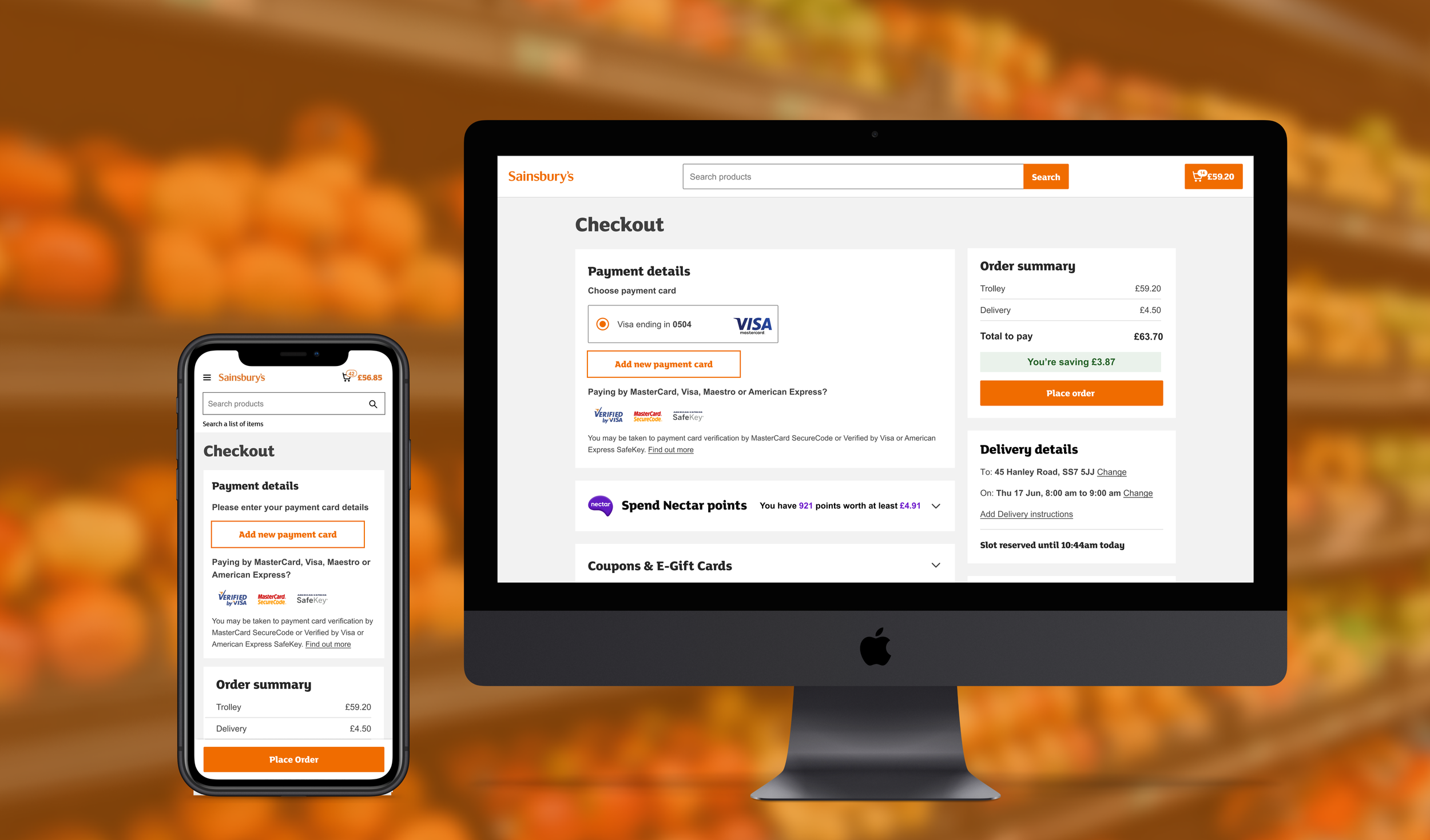
Keeping the place order CTA in the same place throughout all checkout stages to help the customer easily know where to click and pay for their items. Also consistent placing of Delivery / Collection details to provide reassurance of slot booked and when.
-
Research proved that imagery helped customers to remember more items in their basket if we showed images. So we mirrored the trolley view to help give reassurance and consistency for the customer.
-
Some of the major checkout pain points raised by customers in the Lettuce know feedback channel was around not knowing how to spend nectar points or use coupons. So we reworded all the copy to be more simple and explanatory and also gave clearer feedback of what they have added to their order.
-
Old error messages used lots of technical jargon and were confusing. We updated the error styles to match the rest of the site using a Luna design system component. Also we made sure we highlighted inline on the page where the error was and what the customer needed to do.
-
We knew from customer research that Sainsbury’s has poor value perception. An outside research agency recommended dialling up the savings view at checkout. By doing this it means we are then reinforcing value perception to the customer just as they complete their journey.
-
A colleague pain point was that we can’t show the discount a colleague gets at checkout. So receive a-lot of feedback from new colleagues not sure if their discount is applied or not. The ideal solution would be to show the discount. But seeing as that was not technically possible. We added an informative banner instead explaining that the colleague will get the discount and that they will be able to see it in their e-receipt.
-
When looking at where customers clicked on the page we could see that the upsell products on the right hand column had a very low click rate. All UX recommendations were to streamline the checkout process and focus the customer on checking out and paying. So we removed them to get rid of any extra distractions for the customer. We have an upsell page just before in the checkout process so recommended the Ecom team place the products there instead.
-
The current screen design was done before we had the Luna design system so all current components were the wrong size and not part of the design system. We took the Luna design components and text style to make the foundations of the screen. Then I created new components that were based on Luna principles working with the design system team to get sign off and add the new components into the system.
I set about redesigning the new components for the screen taking an atom design approach to the components. Focusing on one component and working through potential options to share for feedback with the squad, other designers and the design system team.
I worked with the UX copy team very closely sharing designs and getting their input and recommendations on copy throughout the exploration phase of design.
I also had the pleasure of working with our Accessibility specialist early on as well sharing early designs and options to get their feedback on what would best for a screenreader and that I was meeting WCAG Accessibility principles.
Once we got to a good place I then used this components to create the page and a working prototype to start thinking about research. and what we wanted to learn and think out from customers.
Components

Research
I worked with the research team to help define what type of research we needed for the project. i completed a research canvas then we discussed their recommendations. They recommended that I set up a benchmark study.
We set up 2 benchmark tests to ask customers to complete tasks around Checkout. The only difference in the test was the prototype. First group were shown the current GOL WCS Web experience. 2nd group the new GOL UI designs. All tasks remained the same.
Tasks
Place a order
Add a new payment card.
Spend Nectar points
Adding a coupon
Spend an e-giftcard
Add a new address
Add delivery instructions
After the task we then asked the some follow up questions
Please rate how easy or difficult the last task was for you.
Why did you have difficulty completing the task?
How confident are you that you completed the task successfully?
Based on your experiences in the last task only: How would you rate your overall satisfaction with the website?
How would you rate the severity of the problems you encountered on the last task?
Once all studies were completed we compared Group One (current WCS experience) and Group Two (New GOL UI designs) results looking at success rate, time of task completion and participant verbatim


Develop.
At the same time I was working through creating final designs in a templated approach and mocking up how they would look when re-sizing across devices responsively. I used our design system luna components to make the screen consistent and also made all components into symbols in Figma to help add into the design system. I made sure we had final designs for all customer scenarios i.e potential error states, delivery or collection, coupon added.
Improvements we made..
Enclosed Header

Better feedback of Nectar points spend on the order

Imagery for Trolley items

Savings call out

Green van delivery indicator

Better feedback of error states and clear actions

Colleague discount information

Click through a working prototype below or link here
Deliver.
I worked very closely with the dev team supporting them with any design work they needed and then giving UI feedback on all development work. Also co-ordinating the dev team with our accessibility expert to test all the new work through a screenreader so we were ready for release.
We worked with the analytics team to create an A/B test for launch and setting up a dashboard for us to monitor results. We ran the A/B test for a few weeks until we achieved statistical significance and felt confident to roll out to all customers.
We had very positve metrics showing that:
Loading time for page reduced.
Time spent on page reduced
Exit rate from page went down
Conversion on page increased
What next….


After roll out we communicated with the wider business what we had done. I presented in the quarterly playback sessions to 200+ people the work and the results we had achieved. We kept monitoring the analytics and more lagging metrics like the Checkout CSAT score to see over time if we have changed the dial on any other metrics. Then started to iterative on improvements around card payment based on customer feedback and also looking into redesigning the last step of the checkout process the order confirmation screen.